Thursday, March 3, 2022

Look And Learn #1000

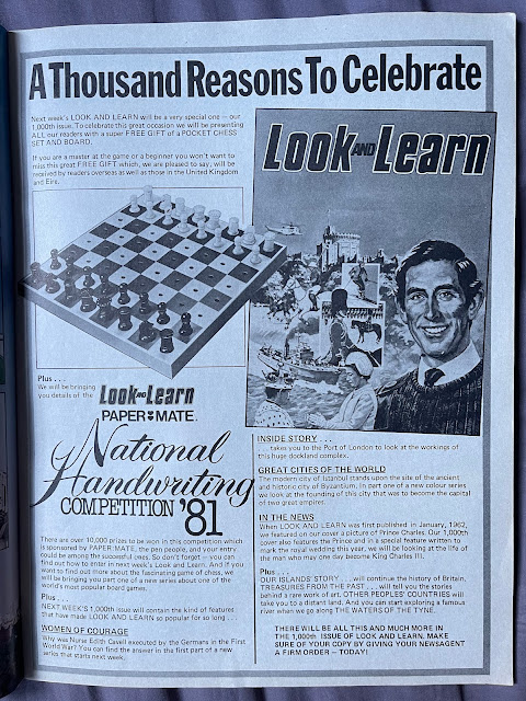
Any title that reaches 1000 issues is impressive and Look and Learn achieved such a feat on 9th May 1981. The celebrations began a week earlier in #999, with a full page advert promoting the big number. As you can see, the issue came with a free chess board, now long absent from my copy. It's also interesting to compare the cover shown in the advert compared with the finished product - a lot more writing was added including the subtitle 'With World of Knowledge' - which had folded and merged into Look and Learn in January 1981. The merger had brought about a few other changes, including a fresh logo dubbed 'The New Look and Learn', with the 1000th issue being the first to drop the words 'the new'. 

Inside, editor Jack Parker welcomes readers to the special issue and gives a brief history of the magazine including the choice to use Prince Charles on the cover, as a nod to the very first issue back in 1962. Personally I'm not sure that's a choice I would have made, but each to their own I suppose...

Look and Learn is more of a magazine than a comic, but it still featured strips sparingly here and there. Issue 1000 contains two such strips, this wonderful two-pager entitled More Adventures of The Trigan Empire. For me the colours really stand out on this page, particularly in the panels depicting the Skorpiad Space-Scout orbiting in space "several leagues above the Elekoton". As was mentioned in the editor's letter, this was a very popular and long running strip that originated in Ranger in September 1965, moving over to Look and Learn when the two merged in 1966 and continuing on until the very last issue. It's nice to see that many, although not all, of the artists are credited in Look and Learn - this strip is drawn by Gerry Wood

The other comic strip in this issue is a Ben-Hur two pager, adapted of course from the famous novel. Sadly the artist isn't credited here. 

Whether sales were already slumping or the revamped Look and Learn simply didn't prove as popular I can't say, but the magazine didn't last too much longer. At 40p it was perhaps too expensive, even though that higher price tag allowed it high quality paper and no less than 15 of its 32 pages were full colour. But a kid in a newsagents could buy a copy of Whizzer and Chips for 14p in 1981, or The Beano for 9p, so I would imagine the far pricier Look and Learn was more bought by adults to give to their children for its educational benefits. Regardless, the magazine folded after a very impressive run of 1049 issues with the final issue dated 17th April 1982. 

Saturday, February 5, 2022

Dennis the Menace Book 1960

Dennis the Menace is, of course, one of the most successful and popular British comic characters of all time. Created by Beano editor George Moonie and the wonderfully talented Davey Law, Dennis first appeared in a half page black and white strip in Beano #452 in 1951 and had his very first book released in 1956. In the early days the Dennis the Menace book was actually a bi-annual affair, meaning today's venture, the 1960 book, was actually the third issued. It cost 5/6 and was a good 80 pages, mostly consisting of a mixture of text stories and comic strips, with the occasional other feature here and there, illustrated almost entirely by Davey Law. Interestingly as well, every single page has red ink with no black and white pages, something I suppose was necessary to show Dennis' famous black and red striped jumper. Before we dive any further into the content though, take a look at the gag on the back cover, where Dennis's dad orders the delivery of a slipper by sail as punishment for Dennis' crimes on the front! Brilliant stuff. 

My copy of this book has, unfortunately for me, been well-loved in its time and a few of the pages have been scribbled over by a young Southampton lad who I shan't name and shame, so instead of showing the title page artwork I'll skip ahead into the strips. Here's a good one as it includes a panel of Dennis handing over what is clearly a 1950s Beano, distinctive enough by its red header. Poor Dennis never catches a break, it is remarkable that almost every strip in the books ends with a slipper in one form or another! Here though, he just gets the knee.

Here's an interesting page - The Early Adventures of Little Boy Dennis. If he's meant to be a baby here it's hard to tell as to me he looks pretty much the same as he always does, save for his sitting in a pram. I'm not sure who the artist is, but it isn't Law.

One more strip before we move on to some of the book's other features, and what better a page to look at than this wonderful fireworks story! This page also illustrates well an artist working in the style of Law with a four panel gag at the bottom, something known as "ghosting".

Here's a breakdown of what those aforementioned 80 pages consist of: the front and back covers, 48 pages of comic strips, 20 pages of text stories, 3 puzzle pages, 2 pages of jokes, 1 title page, 1 'this book belongs to page', 1 page with a letter from Dennis welcoming readers to the book, and 2 funny poem pages. Here's an example of one of those poems, entitled There's Fun To Be Found in Dustbins'.

Text stories were slowly disappearing from comics by the early 1960s but this book still features ten of them all at two pages long. I've chosen to share this one based solely on the illustrations alone, I particularly like the image of Dennis' parents AND cat jumping for joy as he runs away from home! 


Most, if not all, of these strips are reprints I believe, but regardless the annual is a nice way to get a glimpse into an era of The Beano that is very collectable and expensive these days. There's no era of The Beano I don't like, in fact I still buy the occasional new issue from my local comic shop, but there truly is something special about the quality of the content D C Thomson was putting out in the 50s and 60s. If you ever come across any of the comics or books from this time they are well worth a read.

Wednesday, February 2, 2022

Meet The Winners


Launched on 5th May 1979,
Jackpot was another addition in the long line of IPC comics and, although not well-remembered as a title that particularly stood out, it certainly had its moments. One such moment came about a year and a half into its run, when The Winners arrived in issue #75. As the first panel makes clear, "the Winner family decided to enter every competition going", and the lengths they would go to and the prizes they would win were the winning formula (pardon the pun) for this long running strip. In fact, The Winners proved very popular, surviving Jackpot's merger with Buster in February 1982 and continued, admittedly in reprint form, up until the last issue in 2000. Although The Winners later came to be drawn by Mike Lacey and Jimmy Hansen, this first strip is actually the work of Jimmy Glen.

Monday, January 31, 2022

Oink! No. 13 (1986)

Oink! is one title I've thus far neglected to cover much on this blog, but hey - better late than never! So let's amend that with a dive into what is probably my favourite issue of one of the weirder comics published by IPC - lucky number #13. Launched in May 1986, Oink was still a fortnightly comic at this point (it would later go to monthly). Many people actually seem to consider Oink as "a Viz for children", indeed that is a phrase I have seen thrown around a lot, but it is simply not a true statement. I asked Tony Husband, one of the creators of Oink!, some years ago for something I was writing (and never finished) about whether the creation of a "Viz for children" was the intention of Oink, and this is what he had to say:

"No that was never our intention. The three of us, Pat Gallagher, Mark Rodgers and myself all wrote for the IPC comics and we just wanted to take the piss out of the formulated but enjoyable mainstream comics. We spoke to Bob Paynter who was the head of children's comics and he gave us money for a dummy. Years later John Brown publishing and the Donalds came to us about doing a kids Viz bit it never happened."

Oink! certainly is a comic unlike anything else put out by mainstream British comic publishers before. Those of you who've read Terry Bave's 2012 autobiography 'Cartoons and Comic Strips' may recall him discussing Krazy as, well, a "really crazy comic", where "a number of artists and writers had been invited to submit 'crazy' ideas, many turned out to be too crazy for consideration", and by Oink's standards Krazy would be considered somewhat traditional! (Krazy is another comic a little overlooked on this blog too, that may have to be amended soon as well.) To illustrate my point, here's a bizarre photo strip entitled Snatcher Sam meets Young Frankenstein. I can only imagine how much fun this would have been to produce. 

Issue thirteen is of course an unlucky number, well known to the Oink creators, and furthermore this issue was the very first Oink halloween issue - what a coincidence! For 30p readers got 32 pages, printed on nice glossy paper, 9 of those pages in full colour and a further 6 in partial colour with either a pink or yellow ink. That full-colour page count includes the poster on the centre spread, which is an absolutely stunning piece of artwork by the aforementioned Tony Husband featuring his popular character Horace (Ugly Face) Watkins, drawn in the style of a 1950s US horror comic cover. If it didn't mean taking apart an old comic I would definitely have this up on my wall. Perhaps a photocopy is needed...

Another interesting addition to this issue is this 3/4 page text piece Dennis Nifford's History of Horrors. Obviously, this is the pig alter-ego of famed comic historian Denis Gifford. I can only assume it was he who put this piece together, for as well as being a fan of comics he was very much involved with them. 

-- UPDATE! Thanks to Lew Stringer and other good ol' piggin' pals over at the Oink comic fan page on Facebook for informing me that actually this page is NOT by Denis Gifford as he was not a fan of Oink. In fact being an old school guy he didn't like any comics that didn't seem to follow the traditional style, such as 2000AD. I was very surprised to hear this, to say the least! The artwork is actually by Steve Gibson and potentially written by Steve as well, although if not it may have been Mark Rodgers. --

So what are some more of these weird and wacky strips I keep going on about? Well, what about this one entitled Billy's Brain. About a young boy called Billy and his uncle, who exists only as a brain, it's certainly not a strip I could see appearing in Buster or The Beano. It's unsigned but I think this is drawn by David Haldane.

Monster Mash is perhaps the funniest story in this issue. Illustrated by Lew Stringer and written by Mark Rodgers, it is a short story filled with brilliant gags - my favourite is the "school dinner disposal unit" wearing hazmat suits as they dump the toxic dinners into the "hidden dump". This is the first appearance of Pigswilla, a character who would appear a few times throughout Oink's run, and Lew talked about the character's creation in a post on his art blog. Here's what he had to say:

"Mark had originally sent me an idea for a story called The School Dinner Monster and asked if I had any ideas to add to it. I added a few bits and bobs to the plot and dialogue, and thought that the title Monster Mash was catchier. I gave the name 'Pigzilla' to the giant robot pig, although Mark changed that to the much more inspired Pigswilla."

Anyway, here's the two-pager. I really wish this had been given full colour treatment, as I feel it would really have made use of some disgusting school dinner colours to add some extra effect! In fact, another copy of Oink (#66) I happen to have to hand contains a full-colour, nine (!) page Pigswilla comic which I might have to share in a post here sometime soon, just for fun, and you'll see what I mean.

The last strip I'll share is a silly page that is perhaps a bit more 'normal' as far as IPC comics go, emphasis on a bit - The Curse of the Mummy, illustrated by Jeremy Banx. I say this one is a bit more normal only because it reminds me of a strip from the early days of Whizzer and Chips called The Mummy's Curse, in which two unlucky explorers are chased around the world by an angry mummy whose tomb they disturbed. I've also shared an example of that strip, taken from Whizzer and Chips #2 (25th October 1969) and illustrated by Reg Parlett.


Oink ran for about two and a half years before folding in October 1988. Sadly its unique appearance also made it somewhat controversial and some newsagents allocated it to the top shelf, above the eyes of children, and sales ultimately slumped and the plug was pulled (although I'm sure this wasn't the only reason). For those who want to read more about Oink I highly recommend Phil Boyce's excellent Oink blog, which has moved to a new home on Wordpress and can be found here: 

https://oink.blog

Sunday, January 30, 2022

An Interview With Tom Paterson

Some of you might remember back in the days this blog published a bit more frequently I also put out a comic fanzine called Atomic Comic. Fanzines are a LOT of hard work and issue three was certainly the hardest, especially as we decided to print physical copies of this one. Anyway, it was always something I was proud of and I recently came across my copy of it when going through a stack of comics and remembered the interview I had with the great Tom Paterson. Since most people don't have a physical copy (I can't remember how many we sold, but I do remember taking a loss on each one!), I thought it would be a valuable exercise to share the interview on this blog too. This interview is originally from 2016. Enjoy!


I'll start by asking about the smelly sock. It has become the most famous piece of heavily scented footwear in the world but why do you include it in all your comic strips? What was the inspiration for it?

Well, obviously, it's a fundamental symbol of democratic solidarity isn't it? Everybody gets smelly socks... from the humblest tramp to the highest lord in the land... I mean, even the Queen gets smelly socks - in fact, not a lot of people know that her man has got a right pair of pongers humming away inside those great steaming green wellies she's always clomping around the Highlands in! Naah... actually, I used the smelly sock as a kind of trademark because when I started drawing comics, the artists weren't allowed to sign their own names on their work, and I chose a smelly sock because it was a daft little thing that made me laugh... then again, maybe I'm very easily amused!

And of course, you've also got the 'Little Squelchy Things' that appeared in a large amount of your calamity James strips - how did those come about?

I first came up with the Little Squelchy Thingies at school - my old notebooks and sketchpads were covered with them. Later, I was reminded of the, when the great Leo Baxendale started putting little squiggly creatures in-between the frames of some Sweeny Toddler stories, and decided that I could use the Squelchies to inject more humour into my own strips. When I began drawing Calamity James for The Beano, I thought that a James was so con genetically unlucky, he would naturally be plagued by some kind of annoying pests and the Little Squelchy Thingies fitted the bill perfectly and, of course, they proved very popular and were great fun to draw. 

What was your very first published work and where did it appear?

Hmmm... not sure about the first published work, but the first strip I was asked to draw for Fleetway was called Biddy's Beastly Bloomers - a story about a little girl who had three horrible, gluttonous Triffid-like pet plants which was originally drawn by Sid Burgon. Sid was a terrific artist and he had a unique drawing style that I was asked to reproduce. Unfortunately, at the age of 17, I really didn't have a clue what I was doing and I made an embarrassing, ghastly mess of it... it was so bad, it's a miracle they gave me more work!

In the 1970s you drew a fire pages of a strip called 'The Dangerous Dumplings' for D. C. Thomson but you instead ended up working at Fleetway/IPC. What caused you to change?

When I was 16, I sent some examples of my work to D. C. Thomson's and was very surprised when the Albert Barnes, the legendary editor of The Dandy, visited me at my mum's house and asked me to draw a new strip called The Dangerous Dumplings. Now, for a young lad, Albert Barnes was a very distinguished and intimidating gentleman, looking like a retired ex-army major (actually he had been in the navy). Anyway, he wanted me to draw the Dumpling family with large, prominent chins, (he was quite proud of the fact that Desperate Dan's famous chin was based on his own large chin... Albert had quite a thing about chins!) whereas I, with my vast experience, (Not!) was of the opinion that the name "Dumplings" suggested that they should be a flabby, overweight bunch of obese slobs... and so we had a bit of a stand off, during which Fleetway stepped in with the offer of a regular supply of weekly work and that was that. 

When Watford Gapp first appeared in Whizzer and Chips in the late 1980s you used a different style to draw him, which you now use on your current Viz character Jasper the Gasper. What caused this change? Do you have a style you prefer? 

Bob Painter, the managing editor at Fleetway, asked me to come up with a few ideas for some strange, slightly weird strips, one of which was Watford Gapp, and I just thought that it needed an alternative style to give it a different, darker look from my other strips which were running at the same time. I've worked in a number of styles over the years, but I enjoyed the Sweeny Toddler/ Calamity James style, which was of course inspired by the legendary comic genius Leo Baxendale - and the Watford Gapp one, which was influenced by the amazing Robert Crumb. 

You have drawn many characters over the years for various comics. If you could draw any character again, who would it be? Did you ever have a character you would like to have drawn but never got the chance?

I always loved drawing Calamity James and Sweeny Toddler, but I'd really like to have my time over doing Leo Baxendale's brilliant creation, Grimly Feendish. I was asked to draw the strip when I was quite young, but I really didn't have the first idea what I was doing and made a right pig's a**e of it! I'd also have loved to have drawn the unforgettable 'Jonah' and 'Frankie Stein' by the incomparable Ken Reid. Jonah especially used to have me in absolute hysterics... the combination of great scriptwriting and Ken's hilariously manic artwork is simply unsurpassed.

And what inspired you to start drawing? Did you have any artists you looked up to and learned from, or was it just a natural ability that you taught yourself?

I've been fascinated by comics for as long as I can remember. Apparently, I was copying Disney characters around the age of 4 or 5, but the first comic character I really latched onto was "Nick Kelly" in the Topper comic, which was drawn by a great artist named George Martin. I later discovered the beautifully drawn, technically brilliant and fantastically funny work of Leo Baxendale and Ken Reid and I knew what I wanted to do... although the idea of drawing comics for a living seemed a ridiculously remote notion at the time.

What is your all time favourite comic, either to work on or to read?

My favourite comic has always been The Beano, although I also loved Dandy, Beezer and Topper. Later, I discovered the amazing Wham and Smash comics, which were almost entirely the brilliant work of Leo Baxendale. These days I find Viz comic very funny and am lucky enough to have been writing and drawing regular strips for it over the last year or so, which has been really enjoyable. 

Your strips are well known for the many bizarre and random objects lying around, or eccentric millionaires throwing away fivers etc. Were you told to put these in by scriptwriters or are they just added in by yourself whilst drawing up a page? What was the inspiration for these?

All the additional humour and subsidiary shenanigans I always came up with by myself. One of the many things that drew me to Leo Baxendale's work was how, once you'd read the basic story, you could go back time and time again and discover hidden jokes and funny goings-on you'd missed the first few times - his strips were always fantastic value - and Ken Reid's strips were similarly detailed and rewarding. I've noticed how a lot of aspiring artists seem to base their work on the "Cartoon Network" look, and while that works great on telly due to the movement and sound effects, once transposed onto the printed page, it can look very flat, static and one-dimensional. Animation and comic art are two entirely different mediums - a comic artist has to convey the illusion of depth, movement, speed and even sound, and had to add extra character, humour and interest to make the page work on several levels. I would seriously urge any budding comic artist to seek out the superb back catalogues of Leo Baxendale and Ken Redi - if you can't learn anything from those two comic masters - you'll never learn!

You have drawn a lot of pages, but what happens to all the original artwork? Does it all pile up in a corner of your house?

Years ago we used to post the original artwork (I know!) in to the editorial office, so there must be an awful lot of my pages lying somewhere in a leaky warehouse in Dundee - I really must make enquiries about that. (Are you listening, D.C. Thomson?) These days, it's all emailed off so I'm gradually accumulating quite a tower of dusty pages of artwork which is fast becoming a critical space problem - potential buyers, please apply within!

Have you ever considered creating your own comic or annual, such as Leo Baxendale's Willy the Kid books? I'm sure fans would love to see something along those lines from you.

I've had a go at creating my own comic a couple of times, but the problem's been that the nasty, greedy, grasping publishers tend to want to steal all the copyright from the artist for doing exactly f**k-all!

What work do you have planned for the future?

As I say, I'm very happy writing and drawing for Viz at present, although I'd like to get into the children's market again. I recently contributed to Jamie Smart's new venture, Moose Kid Comic, and I'm currently working on a specific idea for another weekly publication, so watch this space!

Before we conclude the interview, have you anything else you'd like to share?

Oh, dear... how much space have you got? I'd just like to say how sad I am at the continuing deterioration (with one or two exceptions!) of the children's comic market. What happened at The Dandy, for instance, was in my opinion, nothing short of criminal. 75 years of unique history and precious comic legacy, lost in a few short years due mainly to catastrophic managerial and editorial decisions - and I fear The Beano is headed down the same dead-end route. For f***'s sake!... please, please let's get rid of this mindless obsession with here-today-gone-tomorrow, tenth-rate, so-called celebrities being palmed off as comic characters! (Note to the dim editors... Alan Titchmarsh, Cheryl Cole and Simon Cowell are NOT and NEVER will be FUNNY!! You're meant to be in the HUMOUR business, remember? Du-u-uhhh!) I'd like to see people back in charge who really understand and genuinely cherish the very special art form that is British comics, and stop relying on useless accountants, vacuous marketing types and pointless focus groups. Instead of giving readers what they THINK they want, let's employ truly creative writers, editors and artists to give them something they can't even IMAGINE! That's what BRITISH COMICS should be all about! Tom Paterson... having a rant... and no f*****g wonder!

Thursday, January 27, 2022

Kidzone (1983)

"Hey kids! Look! The FIRST ISSUE of a Brand New Comic just for you - DON'T MISS IT!!" boasts the front cover of this comic in a fashion typical for the launch of a new title. Indeed, these days it's not often I come across a comic I haven't heard of before, but on a recent trip down south to Dunedin I was lucky enough to come across a couple of issue of Kidzone, a bit of a mysterious New Zealand comic from the early 1980s that is as brand new to me as it would have been to its original young readers in 1983. 

Issue one is dated Friday, August 12, 1983, and for 50c readers got a modest 16 pages, all black and white except the front cover and the back which also had some red, and, perhaps somewhat surprisingly, no adverts. For comparison, an issue of Whizzer and Chips dated 24th September 1983 cost 55c in New Zealand and was twice as thick (I don't have any 1980s Beanos to hand as I write this but if memory serves they were slightly thinner and less expensive than their IPC competitors), but the draw of Kidzone is that it is distinctly and unmistakably a 'kiwi' comic. The front cover character is Mickey's Moa, and a friendly kiwi smiles next to the comic's title just above the price tag. Perhaps something of a New Zealand Big Eggo, Mickey's Moa follows the adventures of Mickey, a young boy who befriends the giant bird after finding him hiding in a cave in the bush. Here's the second page of that strip, illustrated by Robert 'Bob' McMahon. McMahon was clearly Kidzone's main artist and was in fact the driving force behind the comic. In this first issue alone he drew 4 different strips of which all but one were at least a full page.

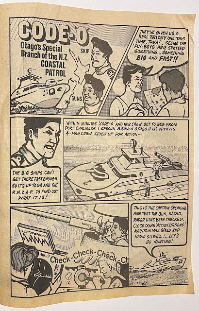
Although inspired by the comics D C Thomson produced (McMahon acknowledges this in an interview, more on that in a minute) the kiwi theme continues inside, another example being the strip Code-'O': Otago's Special Branch of the N.Z. Coastal Patrol (for those who don't know, Otago is a region in NZ's South Island). Although I don't know the artist, a signature does seem to appear in a few of the panels (nos. 4, 6, 7, 10 & 11). 


Here's a name that might be familiar to some of you, Vid Kid. Except not the Vid Kid who graced the pages of Buster from 30th May 1987 through to its final issue, rather this Vid Kid is simply a fan of video games. I believe the artist's last name to be Grundy due to a signature on a later Vid Kid strip in issue #3 but sadly I don't know their full name.

My favourite strip in the comic is certainly this one, Greenslade The Frogillustrated by the same artist as Vid Kid, the mysterious 'Grundy'. It certainly made me chuckle. 


As far as I know, only three issues of Kidzone were produced and judging by the 9th September cover date of issue #3 was a biweekly publication. I own issues #1 and #3, and interestingly the National Library holds the same copies, also missing the second issue. According to a 2012 interview with McMahon, the print run consisted of just over 1000 copies and used artists from The Otago Daily Times, where McMahon also worked. It was put together in Dunedin and printed in Gore by Gore Publishing but was only distributed as far north as Christchurch, so it certainly had a very limited reach. McMahon was bankrolling the comic himself and was struggling to get a sponsor, and his printers would often push him aside for bigger jobs meaning he would have to run around chasing it up. Despite receiving a positive response in the form of "a lot of letters from kids", it sadly failed to last, McMahon deciding that "nah, I don't need this". Elaborating, he says "it was just barely feeling its way after about a couple of weeks, it was burning me out so I flagged it, I realised that because I was doing the whole thing. I was doing the colourations, chasing people up for their work, going down to Gore and literally printing it, printing it the way I wanted. All this sort of thing and it was too much". It's a shame things didn't work out for Kidzone
 as I believe, by marketing itself as a uniquely New Zealand comic, it could have had some potential had it been able to give itself time to become a bit more of a finely polished product. New Zealand made comics are few and far between so it is always nice to come across one and, in my experience at least, people always like to support local New Zealand artists.

The cover of issue #3, this time with
a green kiwi


For those interested you can read the full interview with Bob McMahon on the Pikitia Press blog here: