Tuesday, May 14, 2024

Buster Crosses The Channel


Here's a little piece of comic history that shows there's always more to learn - well for me at least anyway! Buster comic, it seems, was not confined to the English language, but Norway, Finland and Sweden also had their own version. The first issue (seen on the left of the image above) came out in Sweden on 5th January 1967. Norway got its own edition in 1972 and Finland in 1978.

Buster UK (left) and the first Swedish Buster,
both from the first week of 1967.

Here I've put the first issue of Buster next to the British edition from that same week (dated 7th January 1967), and to me the difference is shocking. The Swedish version looks brighter and more modern than its British counterpart. I think it also has a slight feel of an American comic book about it too, with that big block of text at the bottom.

The first issue contained reprints from the British Buster, as well as some original Swedish material. Alongside Mighty McGinty on the front cover (illustrated by Carlos Cruz and here renamed to Dynamit Charlie), it included Buster's Dairy (as Buster's Dagbok) printed on the back cover in red ink, and Our Great Grandpa, illustrated by Trevor Metcalfe. In the UK, Our Great Grandpa only ran for a few months from 5th June to 25th September 1965, but as well as being reprinted here it also had a run in Valiant.

I'm also told that at some point a few D.C. Thomson characters were printed in it as well, including Kid Cox and Kamikaze Kid. That's probably because this Swedish version wasn't actually published by Fleetway, but first by Centerförlaget (1967-1970), then Semic Press (1970 - 1997), and finally by Egmont (1997 - 2005).

The comic was already looking different just a year in.

It started out as a weekly, 32-page comic, but by 1968 the comic became a fortnightly affair and gradually became more focused on sports strips, with even Buster himself becoming a more sporty looking kid. So when the comic launched in Finland in 1978, it was essentially a sports comic entirely with many reprints now coming from Tiger. The cover of the first issue showed Billy's Boots, Nipper, Hot Shot Hamish and Typhoon Tracy. In this version they were known as Eki Eskelinen from Harjumäen sisu, Edward Engmark, Benny Kultajalka and Hot-Shot Hamish was rebranded as Super-Mac. Also here you can see just how much sportier they made Buster, looking more like the son of Roy Race than of Andy Capp!


Like the British edition, there was also a pocket library and a special, this being a yearly 'Sports Special'. I'm not yet sure how long the specials ran for, but the earliest I've seen is 1974, and the latest is 1985.


A few of the earlier Sport Special
magazines.

In Finland, Buster continued until the 1980s, and in Norway the initial run was from 1972 - 1977, followed by a second run from 1984 - 1994. What is most interesting though, is that the Swedish edition actually outlived its British counterpart, carrying on until 2005!

The last issue of Buster, from 2005.

I should just add at this point I don't actually own any copies of Buster not printed in English, so my thanks to those in The Mighty World of British Comics group on Facebook for help with this post. All other information came from me scouring countless auctions past and present, none of which were written in english, of course.

I'm also working on a number of other posts for this blog. I've graduated uni now so life is (supposedly) a little less chaotic, so I'm hoping to be able to post a bit more regularly. Stay tuned!

Wednesday, August 16, 2023

Willy the Kid badges (again!)


I have written about the Willy the Kid badges before (link here) and am pleased to say that, only 10 years later, I have finally completed my set with the badge 'Willy the Kid a bit of a twit'! I do, however, have one question about them: does anybody know the order?

Before he passed away in 2017 I did speak several times with Willy's creator Leo Baxendale. Although he confirmed no badge was made for the special edition book in 2002, titled The Worst of Willy the Kid, I foolishly neglected to ask him about the order. Oops. So if you know, please do comment.

In some personal news, I have recently moved from New Zealand to Melbourne, Australia! Before I left NZ I did take a few photos of some comics I want to cover so do stay tuned for that. Sadly I had to leave my comic collection behind. I still own them, but 2600km or so doesn't exactly make them accessible. Til next time (very soon)!

Wednesday, August 2, 2023

The Last Ever Buster (2000)


I can't believe I've never made a post about surely one of the most significant issues of a British comic - the final issue of Buster. Buster was the last survivor of a Fleetway comic, and for me this final issue is a sad marker for the end of an era. 

For 32 pages for £1.10, it was probably the price that killed it to be honest. It was more than twice the price of The Beano (which cost 52p) at this point, and the quality simply wasn't as good.

Credit where credit is due, I do like this front cover. The main Buster strip is a reprint by Jimmy Hansen, but that bar on the left showing Buster's different styles through the years is by Jack Edward Oliver. Oliver was the sole artist held on at Buster after the comic went full reprint. Mostly, he was responsible for lettering and adding drawings to things that couldn't be done with reprints. I think it would be fair to say that he was largely influential for Buster's unique feel over those final years.

As mentioned, the contents was full of reprints but out of interest and the fact that they're still fun comic strips, I'll show some of it anyway. Perhaps of most interest would be this Specky Hector Comics Collector page, illustrated by Lew Stringer. This was obviously chosen for this last issue as it discusses the launch of Buster back in 1960.

Here's an oddly interesting page - a competition with a whole range of Meccano sets were up for grabs. I say this is odd because it seems strange to me that you would have a competition in the final issue, especially so when there's no other comic they were trying to drive readers to. Perhaps there was simply a pile of Meccano sitting around the office that they needed to get rid of.

Moving on to this Sweeny Toddler strip, illustrated by Tom Paterson. I wanted to share this page to highlight the colouring style that was so prevalent in Buster throughout the 1990s. This strange block colouring was far from the prettiest colouring ever done, but it did give the comic a unique feel and allowed them to brand it as full colour.

Here's an example of a perhaps more well-coloured spread. Bobby's Ghoul is illustrated by Anthony Hutchings, and Watford Gapp by Tom Paterson in a completely different style. I interviewed Tom for issue three of Atomic Comic a few years ago and asked him about this style, this is what he said:

"Bob Paynter, the managing editor at Fleetway, asked me to come up with a few ideas for some strange, slightly weird strips, one of which was Watford Gapp, and I just thought that it needed an alternative style to give it a different, darker look from my other strips which were running at the same time. I've worked in a number of styles over the years, but I enjoyed the Sweeny Toddler/ Calamity James style, which was of course inspired by the legendary comic genius Leo Baxendale - and the Watford Gapp one, which was influenced by the amazing Robert Crumb."


And finally, it is of course the back cover that everybody remembers from this issue. Illustrated by Jack Edward Oliver, it's a wonderfully unique piece that wraps up all the remaining characters in a comedic fashion. Sad as it may be, it was a fantastic way to wrap up the comic.

Wednesday, July 12, 2023

The First Funny Wonder Annual


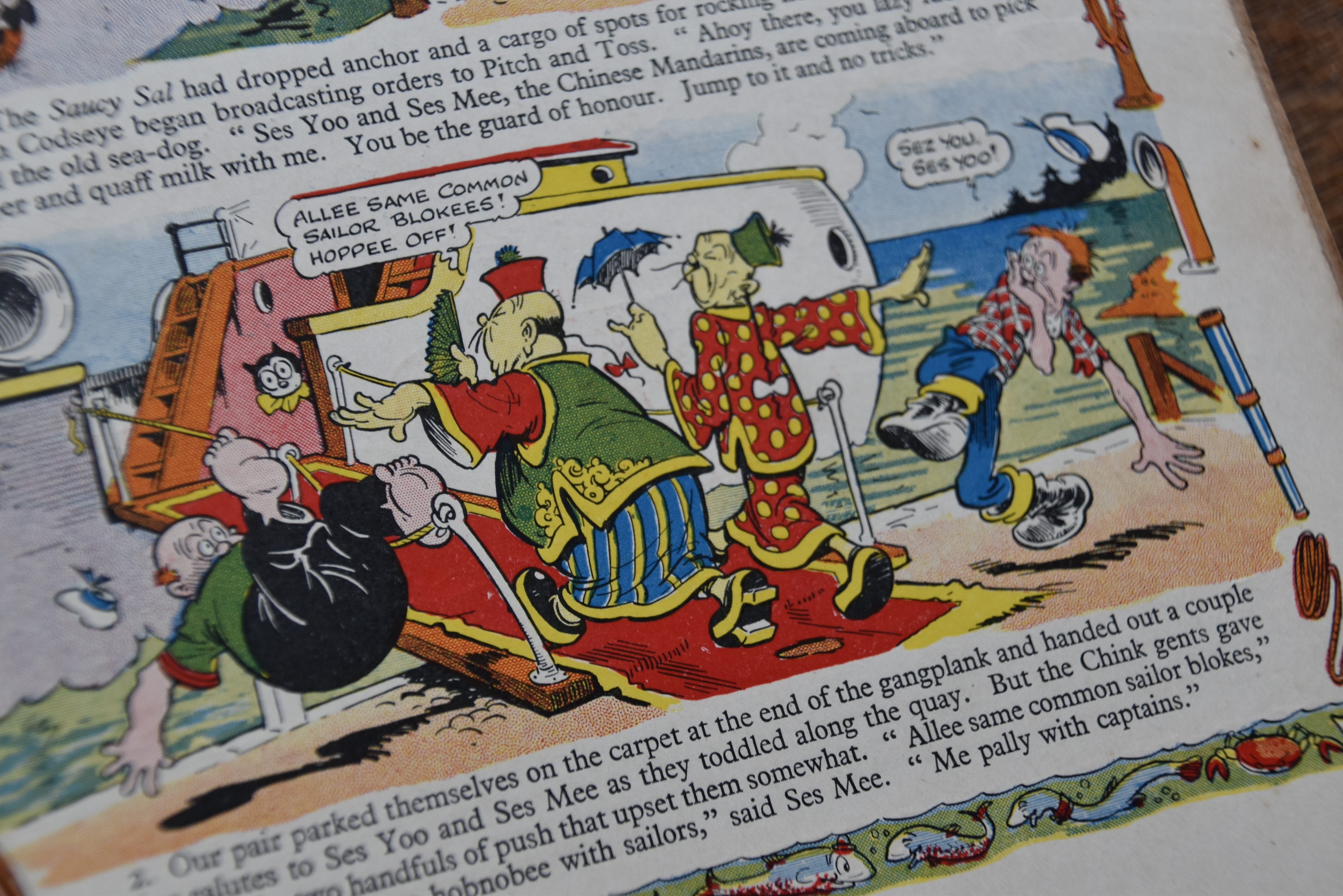
The very first Funny Wonder book came out for 1935, a super-sized edition of the popular weekly comic published by Amalgamated Press. The comic began life in 1914... sort-of, and would continue until 1953. It was actually the second comic to have the name, the first of which was published in the 1890s by Harmsworth Brothers. I'll leave it at that as it's a long and confusing history that I am still wrapping my head around and is probably more deserving of its own post - all you need to know is this is from the second run.

Just from looking at it, I can tell this book would have stood out on any shelf of a 1930s newsagents. Look at the photo above and you can see just how bright it appears when compared to the regular weekly edition. Measuring an inch cover to cover it's also incredibly thick, with pages so heavy they are essentially cardboard.


It cost 2/6, for which readers were treated to 110 pages (not counting the covers). Of those internal pages, nine were in colour, including this wonderful full-page gag illustrated by Roy Wilson. Wilson also drew that stunning front cover, of course.

Advertisements for the annual began appearing in The Funny Wonder in early September 1934. The editor, in the regular 'News From Your Editor' section published in #1069 (22nd September 1934) said "it is the funniest book on the market". 

"My dear readers - I wonder how many of you have seen the Funny Wonder annual for 1935? Those of you who have will know how jolly good it is!"

"Your old friends, Pitch and Toss and the Captain, appear inside, with a number of other fun-merchants and the stories are all written by your favourite Funny Wonder authors! All for half-a-crown!". 

Here are a couple of those adverts:


Moving along inside, and the next page we are greeted with is this letter from The Editor. I do wish the editor was named so I could tell you who it was, I also wonder if it is the same editor for the weekly comic. I assume it would be. I like this third paragraph here, promoting the "weekly blue-coloured paper The Funny Wonder".


The book is a wonderful mixture of stories, comics, puzzles and pictures - a fantastic annual that really utilises the space it has. For me, the highlights of this book are the full-page illustrations by Roy Wilson, the king of slapstick. There were two others printed throughout the book in addition to the full-colour one show above, both with black and red ink. Oh how I wish these were also printed in full colour, but of course doing so was expensive in 1934 and colour had to be used sparingly. Wilson was a master of the craft and I certainly haven't written enough about him on this blog. So significant was his work, and at such an important identity-forming time for British comics, I don't think it would be unfair to say that his style and legacy live on through artists working today.


There are plenty of text stories covering a variety of exciting genres, from far-away adventures to mysteries, this book has everything. Any child would have spent hours pouring through them, they really are fantastic. They vary in length so I'll show a shorter one - The Automatic Man. This has it all - a robot, a burglar, and a fat reward!


Before moving on, I feel I would be remiss if I didn't at least mention the racism in the comic. Sadly there are a couple of instances, shown below, where racial stereotypes were used. I get that such depictions were somewhat commonplace in comics of the time, but nonetheless they do dampen the comic when looking back. I'm glad times have changed.


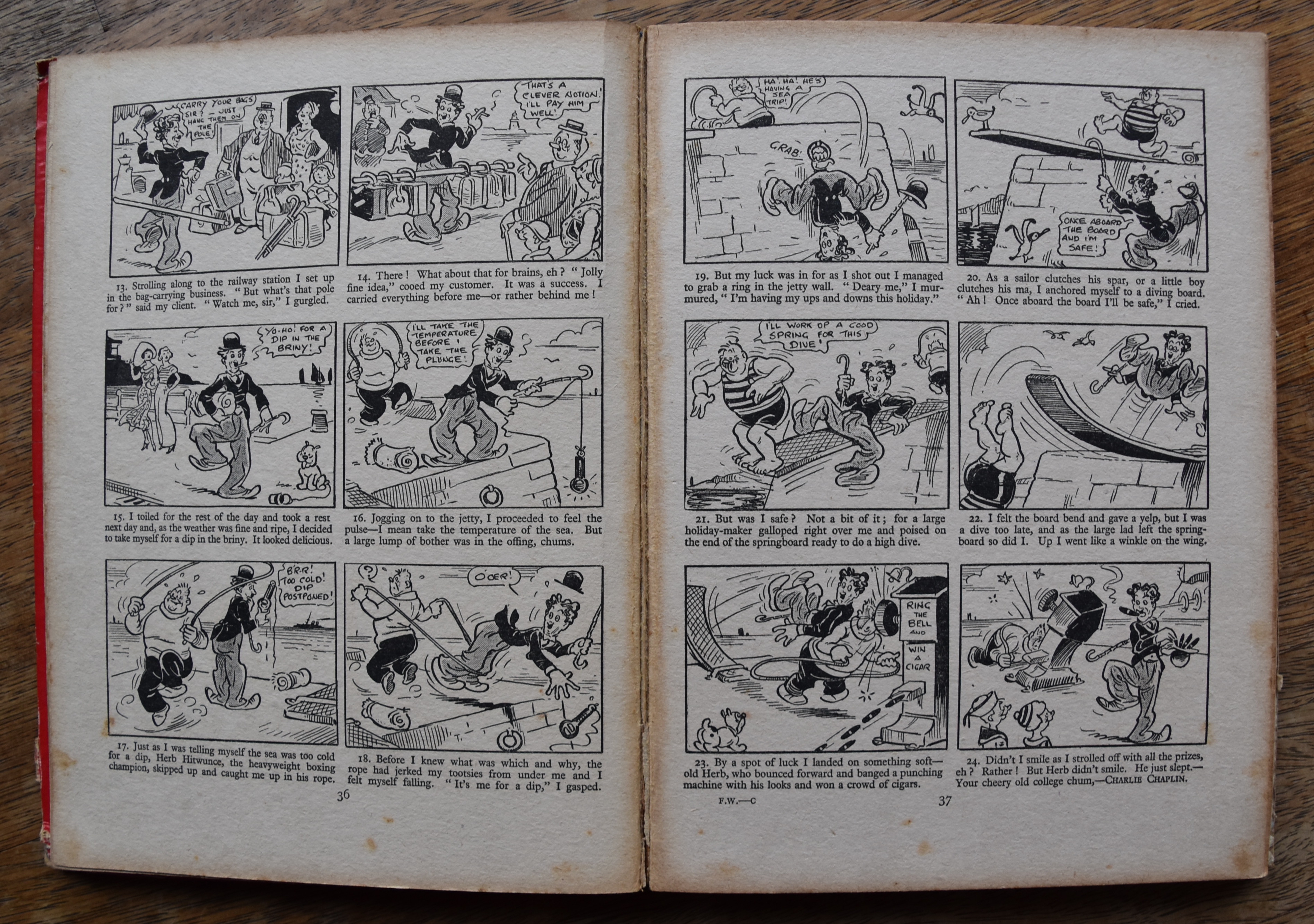
On a lighter note, here's a fun Charlie Chaplin comic strip, partially coloured in by a previous and enthusiastic owner of the book. Chaplin was a regular in The Funny Wonder at this point, with a comic strip on the centre spread every week. It's interesting that the comic has a summer beach theme, given the book was released with intentions of being a Christmas present. It works for those of us in the southern hemisphere, I suppose.


There's also a character called Pearl Pryor in the strip Pranks in the Park who looks incredibly like Keyhole Kate! No copyright claims can be upheld here of course as The Dandy, and Keyhole Kate, didn't arrive on the scene until 1937.


There's plenty more for readers of course but I'll wrap it up for this blog post. The last thing I want to share is this wonderful back cover, advertising various comics published by Amalgamated Press at the time. The Funny Wonder is on there, of course, alongside Larks, Jester, Jingles and Tip Top, each coming out on various days of the week. I love these early comics and wish they were easier to find copies of these days. I know if I had been alive in 1934 I would always be broke!

Monday, July 10, 2023

Vintage Tin Adverts

These beautiful signs sold last week at auction, and I simply couldn't resist sharing them here. Made of tin, such signs were common in the first half of the 20th century and were often tied up outside newsagents - it's not rare to see them in the background of old photos.


Should you have any more cool old adverts, or even just photos of some, please do send some photos of them my way. They're a joy to behold, and I'd love to share some to the site.